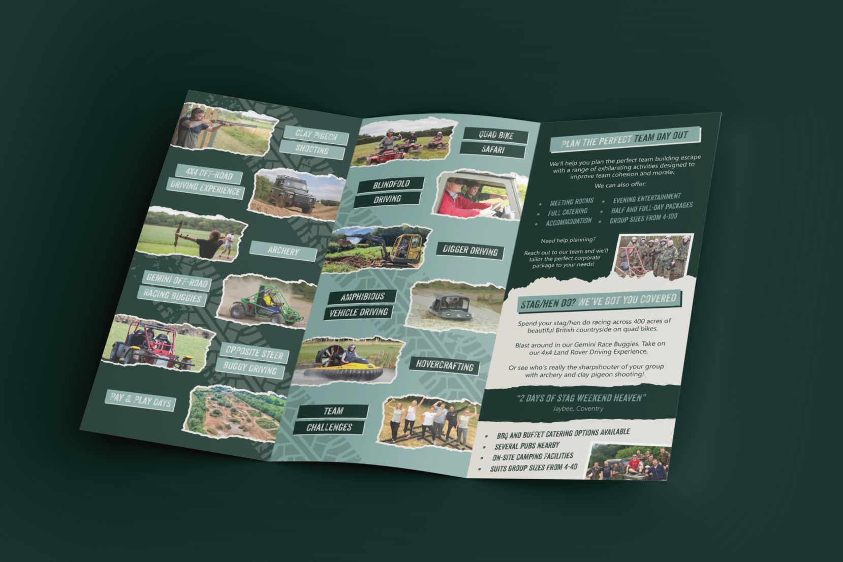
Helping an outdoor adventure company make their offering clearer
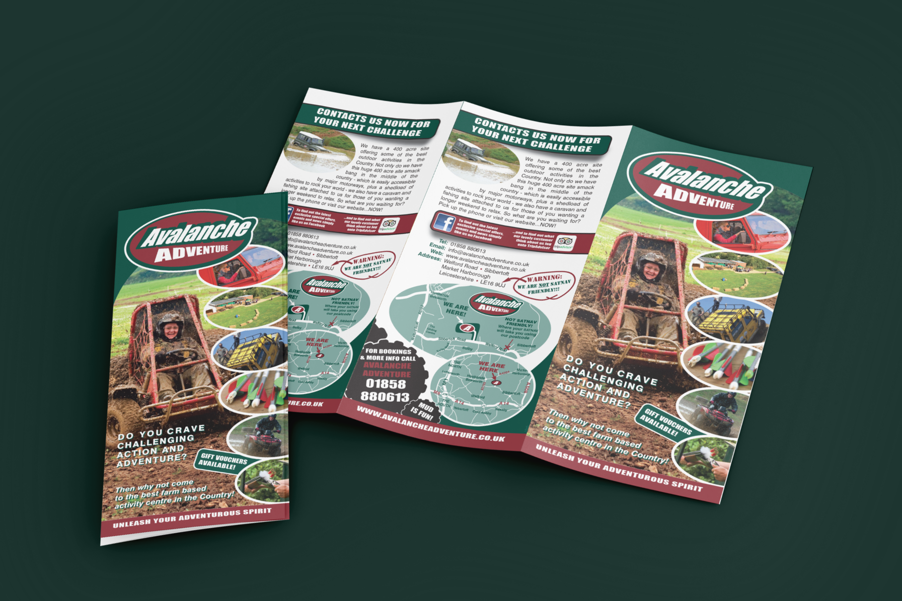
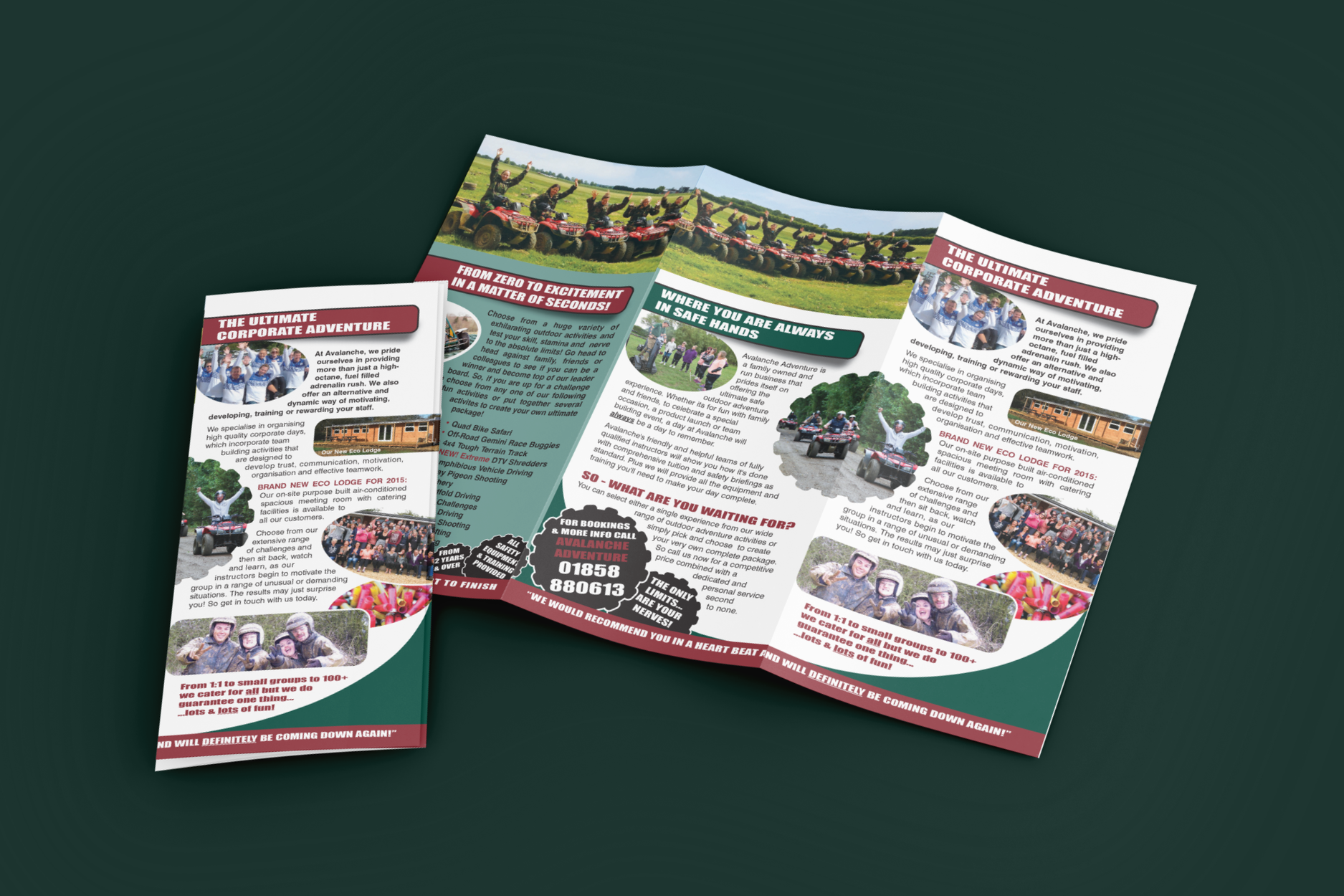
Avalanche Adventure had a leaflet that technically said everything — but in reality, it was asking too much of the reader.
It was packed with information, multiple competing messages, and a layout that made it hard to know where to look first. The kind of thing people glance at… and put down.
The shift
Instead of adding more, the focus was on simplifying and sharpening:
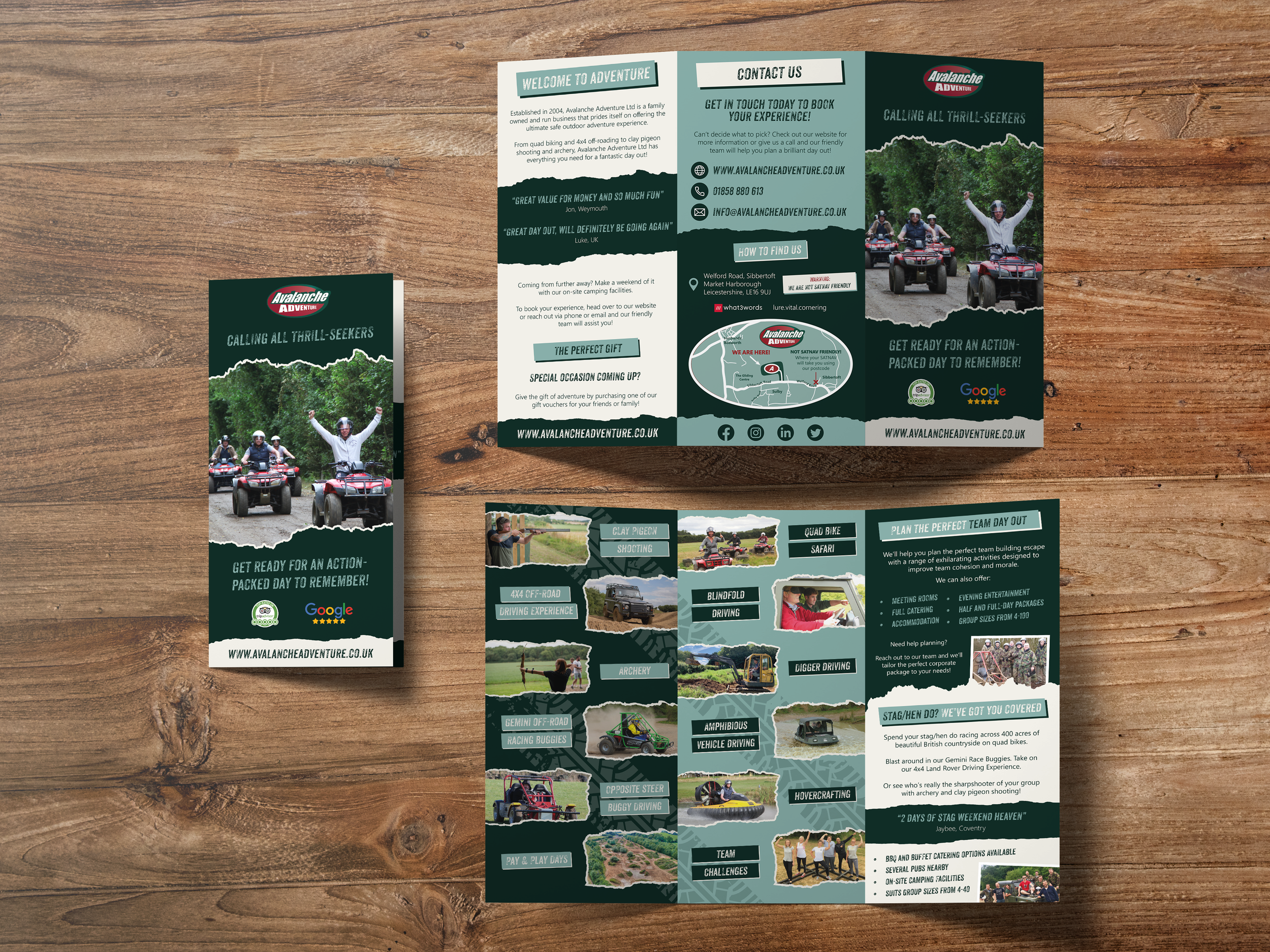
Let the photos lead
Cut back to what actually matters
Make it easy to scan in seconds
Bring key offers (stag, corporate, groups) to the surface
Lead with the experience
People aren’t buying a list of activities — they’re buying the feeling of it.
So the design flipped from text-led to image-led, using the strongest shots to do the heavy lifting.
Say less, but say it better
The original had long paragraphs and repeated messaging.
This was stripped back to:
Clear headings
Short supporting lines
One message at a time
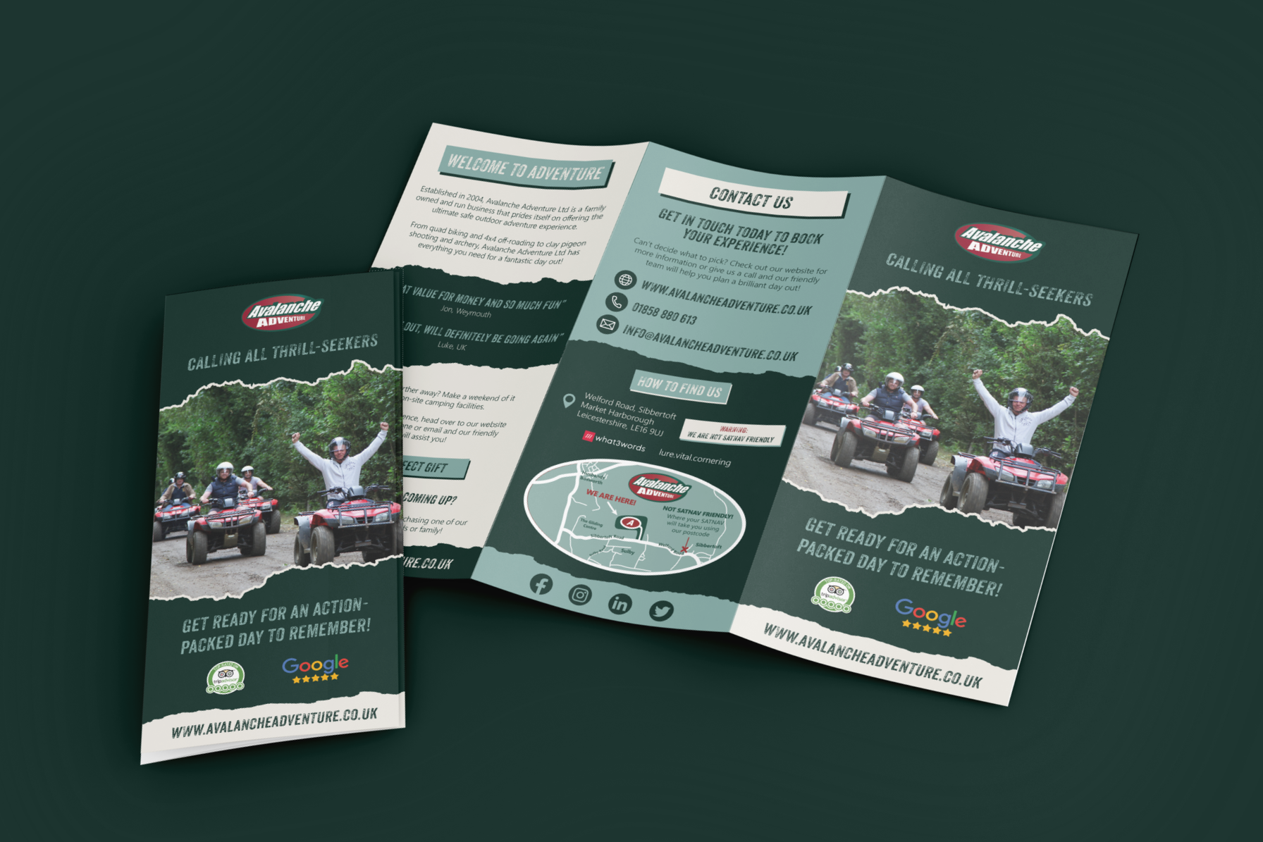
Create a clear flow
The old version felt scattered.
The redesign guides you through:
Hook → Activities → Packages → How to book
Less effort for the reader, more clarity for the business.
Make the big opportunities obvious
Stag dos, corporate days, group bookings — all high-value, but previously buried.
These were pulled forward and given proper space.
The outcome
Easier to understand at a glance
Stronger visual impact
Clearer sales focus
Feels closer to the actual experience
Less explaining. More showing.
This wasn’t just a leaflet refresh — it created a clearer visual direction the brand can reuse across everything else.