Turning a menu into something that actually makes you hungry
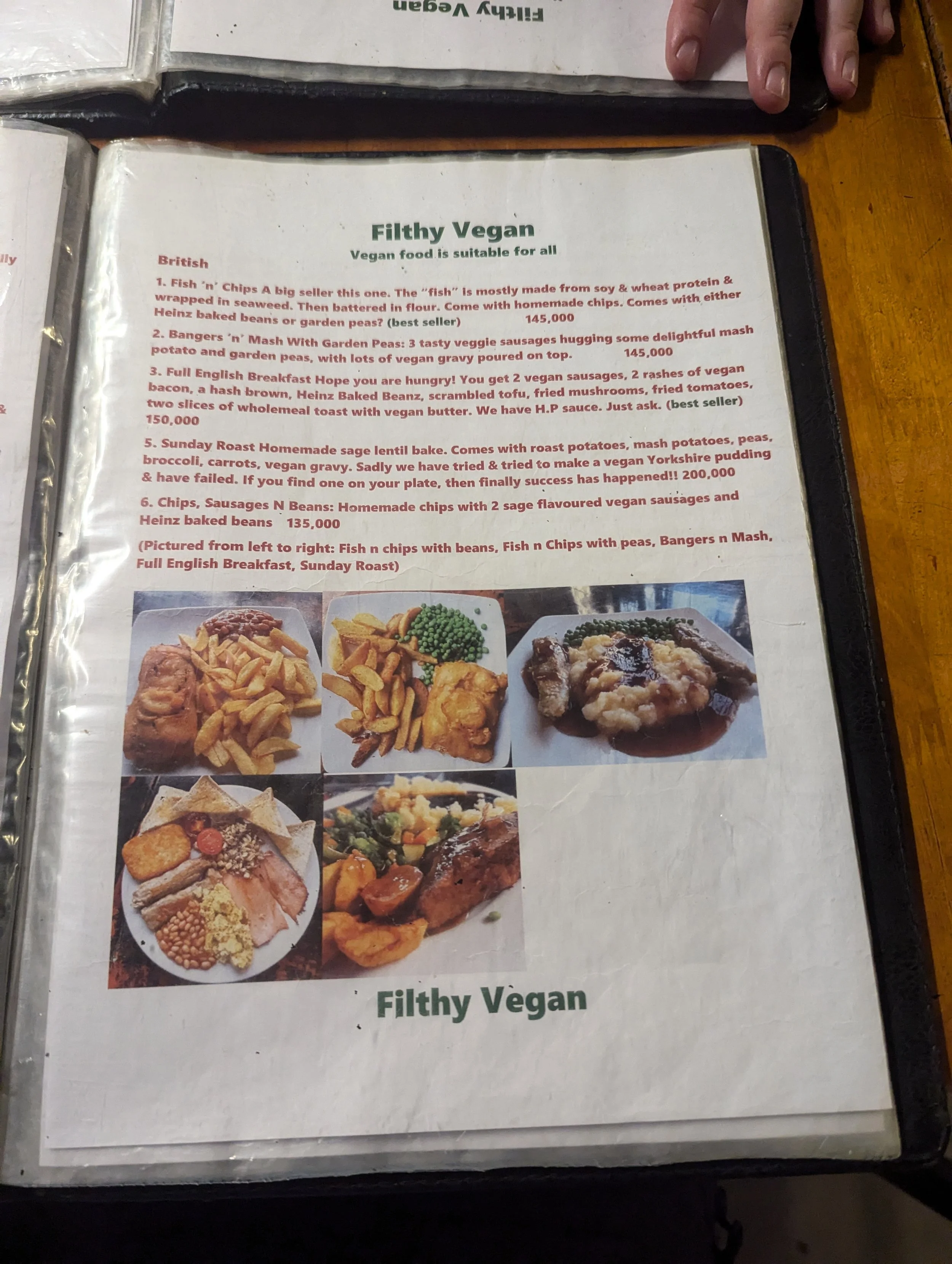
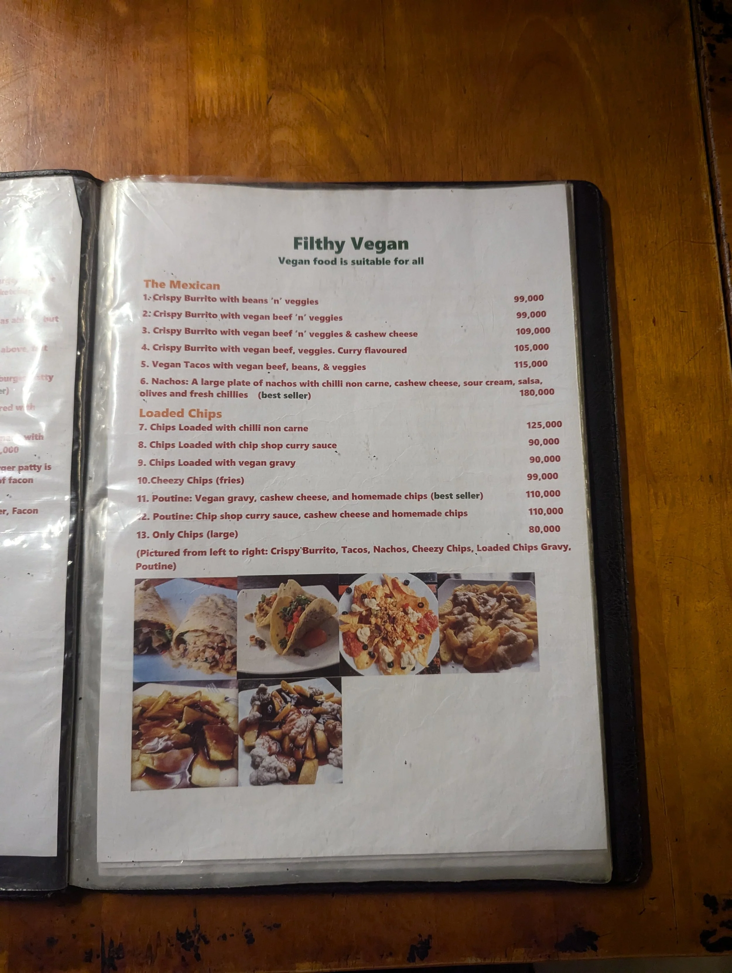
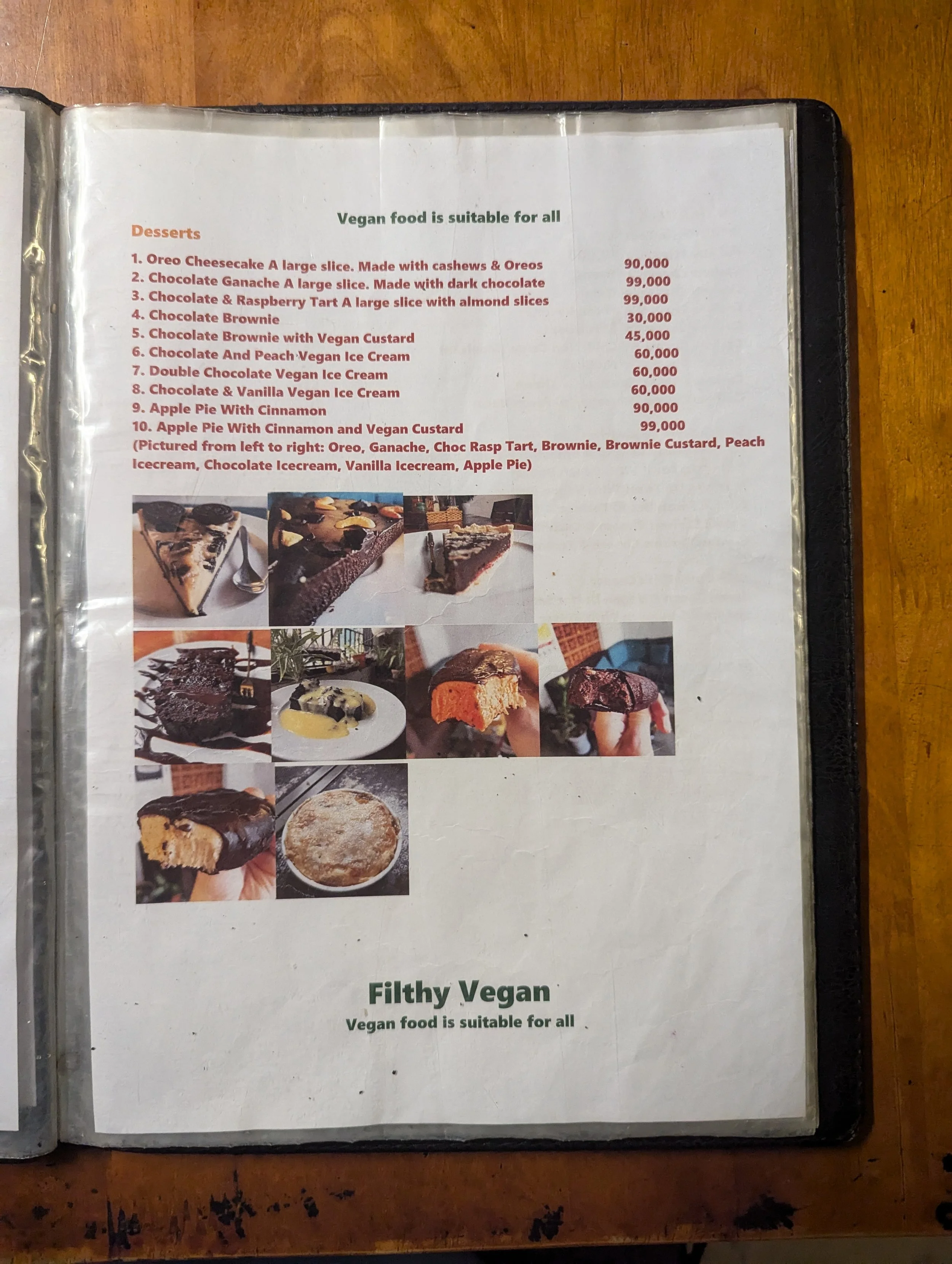
The existing menu did the job… but only just.
Heavy blocks of text with very little hierarchy
Inconsistent formatting across pages
Photos treated as an afterthought
No real brand identity beyond a logo at the top
It meant customers had to work to understand what was on offer — and when you’re sat in a restaurant, that’s the last thing you want.
It also wasn’t doing them any favours online. On platforms like Google Maps, where people often check menus before visiting, it didn’t stand out or build much appetite.
The approach
The goal wasn’t just to “tidy it up”.
It was to turn the menu into something that:
Felt like the restaurant
Guided decisions quickly
Made the food the hero
So the focus became:
Build a clear, consistent brand system
Design for how people actually read menus
Let the food do the heavy lifting
Building the brand (beyond the logo)
The logo was already there — but nothing around it.
So I built out a simple, recognisable identity:
Bold, playful headline type for section titles
Clean, readable body text for descriptions
A tight colour palette (greens, reds, neutrals) to guide attention
Subtle background watermark to add texture without distraction
This meant every page felt consistent, intentional, and unmistakably “Filthy Vegan”.
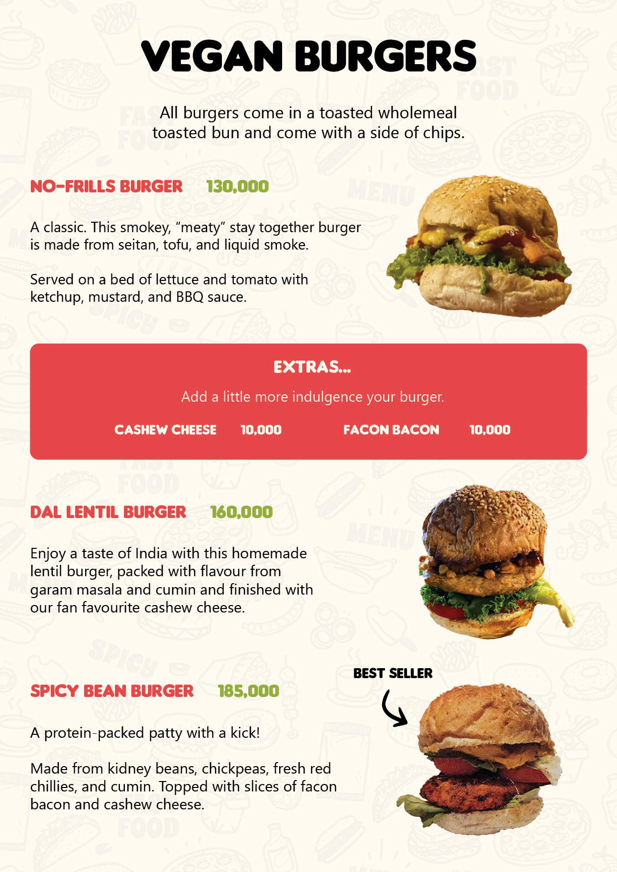
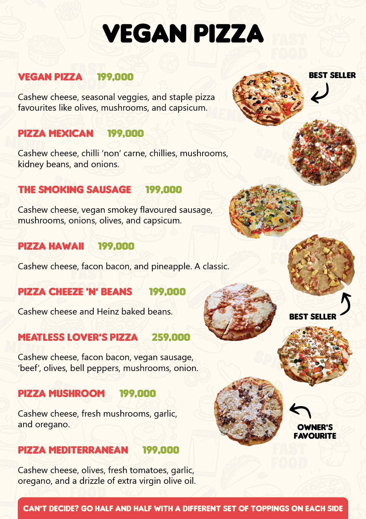
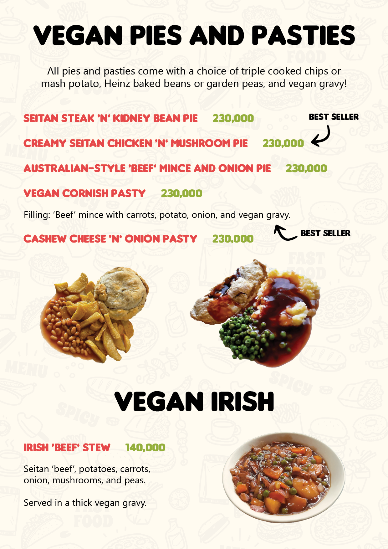
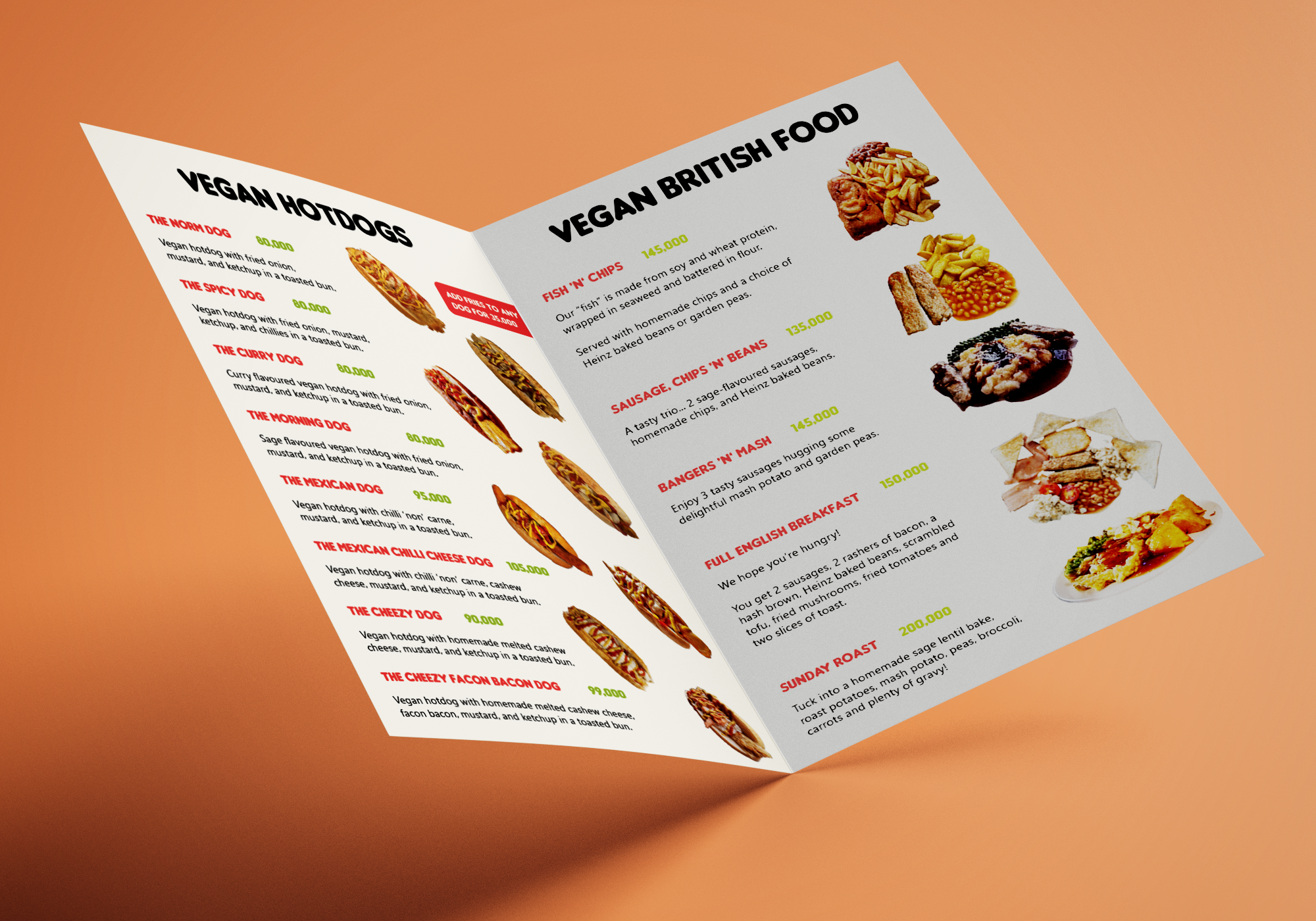
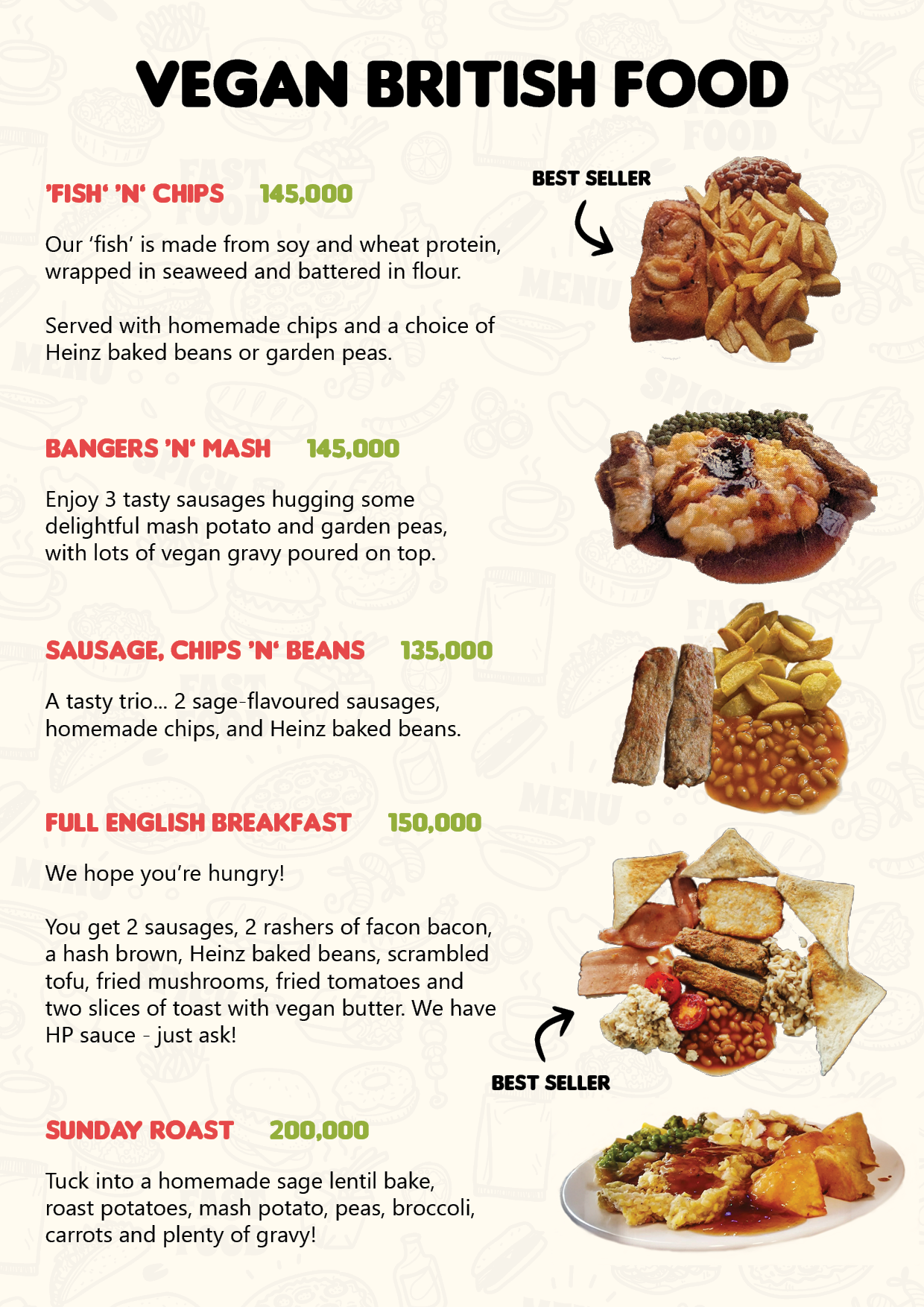
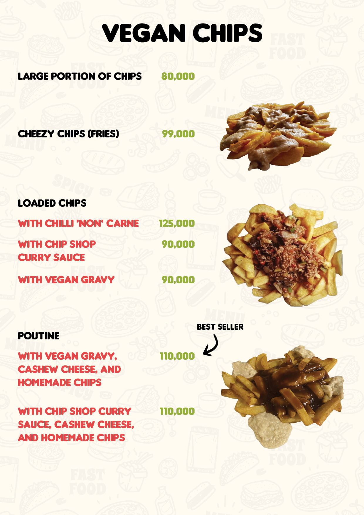
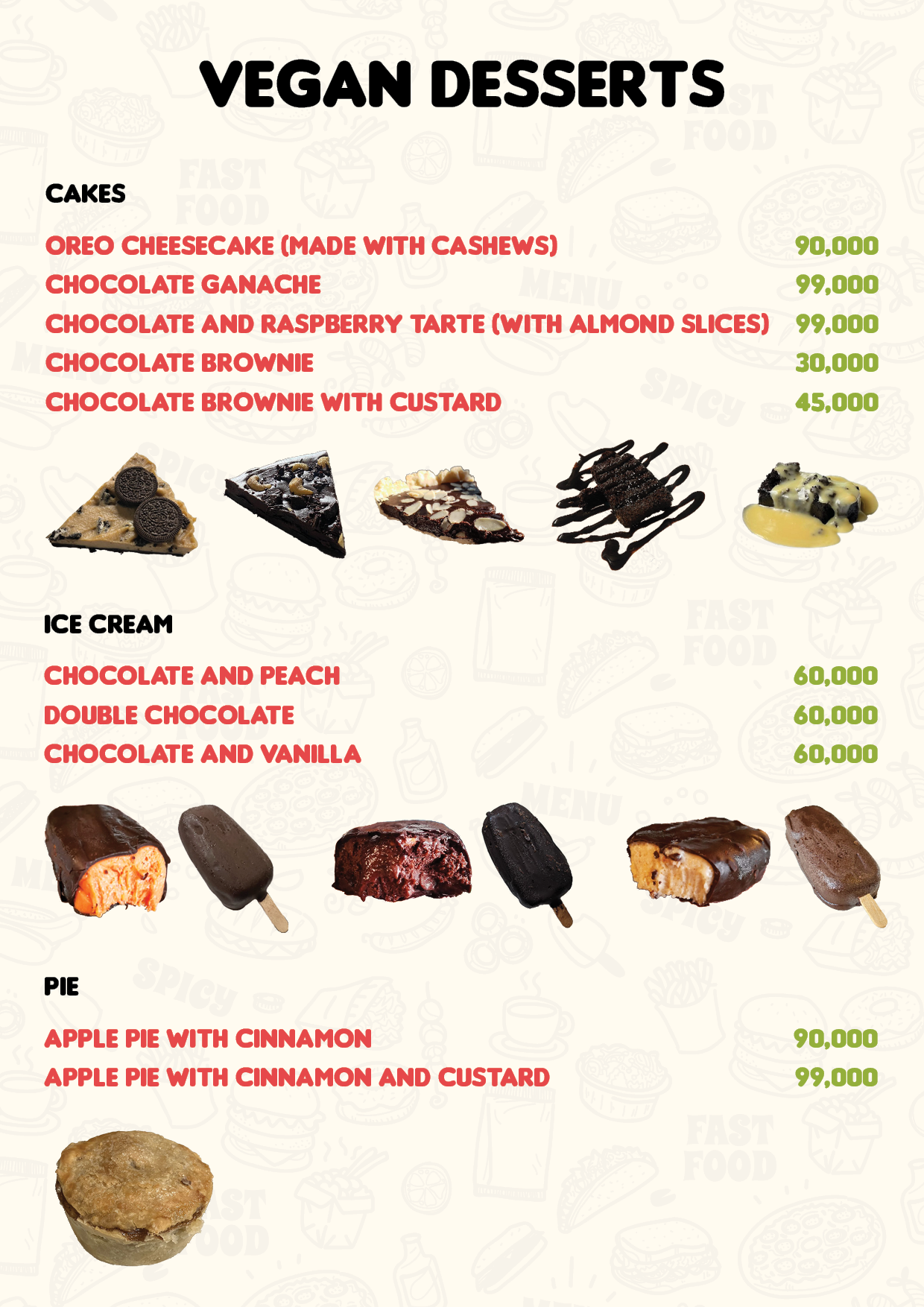
Putting the food front and centre
The biggest shift was visual.
Instead of tiny, low-impact images buried at the bottom:
Food became the focal point of each page
Clean cut-outs made dishes pop against the background
Layouts were built around the imagery, not the other way round
Now, you don’t just read the menu — you scan it and instantly want something.
The result
The new menu doesn’t just look better — it works better
Improved in-restaurant experience - easier to browse, quicker to order, more enjoyable overall
Stronger first impression online - stands out on Google Maps and review platforms
Better conversion from browsing → visiting → ordering