Turning a year of impact into something people can connect with
Challenging Heights is a Ghanaian NGO fighting child trafficking and modern slavery. Every year they publish an annual report — a critical document for donor retention, partner credibility, and public accountability.
Annual reports can easily become dense, text-heavy documents.
This one needed to do the opposite — capture a complex year of work and make it clear, engaging, and human.
The reality behind it?
A lot of moving parts.
The content wasn’t sitting neatly in one place.
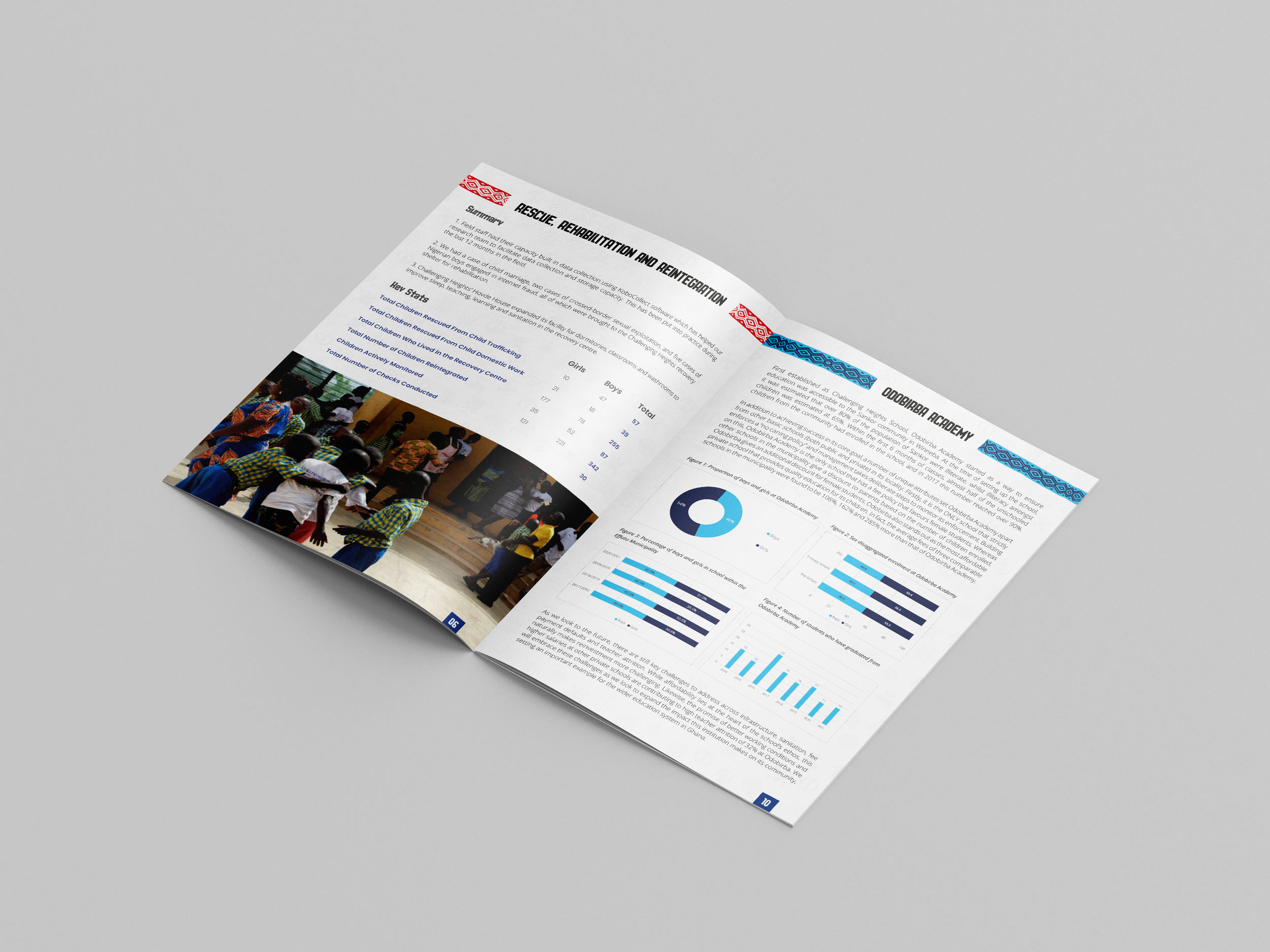
It came from different teams, across different programmes — from rescue and rehabilitation to advocacy, education, and livelihoods.
Each section told a different part of the story.
And everyone contributing had their own priorities, timelines, and limited capacity.
The challenge wasn’t just designing pages. It was…
Pulling together information from across the organisation
Working with content that was still evolving
Structuring it so it felt like one clear story
And making sure it didn’t overwhelm the reader
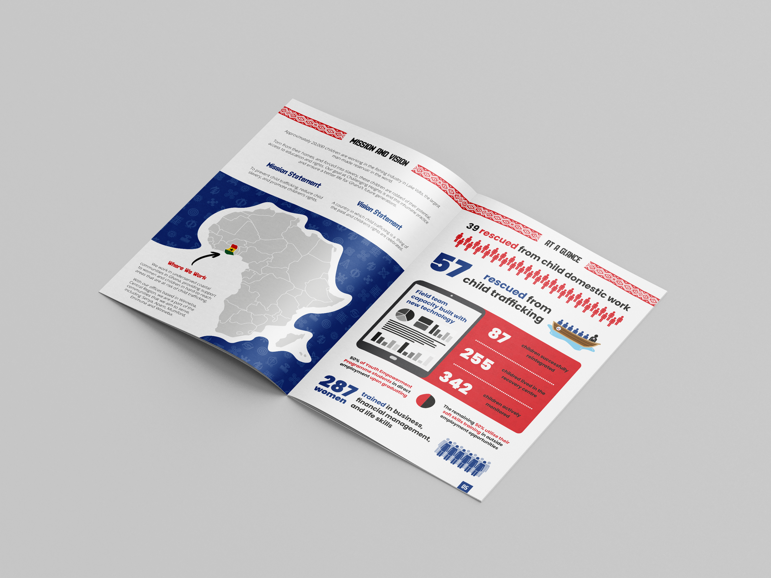
Letting the key moments stand out
Some of the most important information needed to be understood instantly.
So instead of burying it in paragraphs:
Key stats were pulled out visually
Numbers became focal points
Layouts were designed to be scanned, not read line-by-line
Like the “At a Glance” section — where impact is clear within seconds.
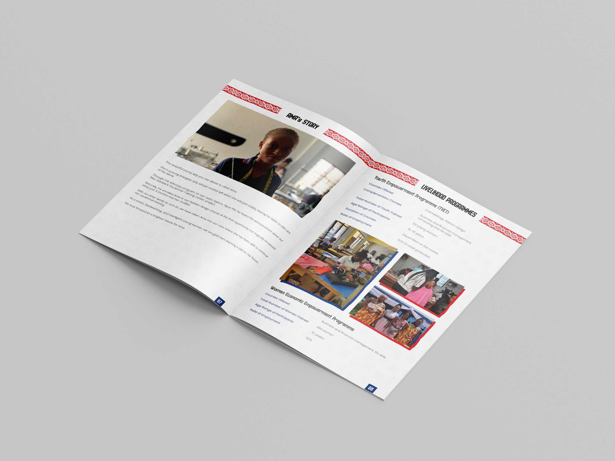
Keeping it human
Alongside the data, the report needed to feel personal.
Stories like Ama’s bring context to the numbers — showing the real people behind the work.
The design gives these moments space:
Strong imagery
Simpler layouts
Less visual noise
So they don’t get lost.
Making complex information usable
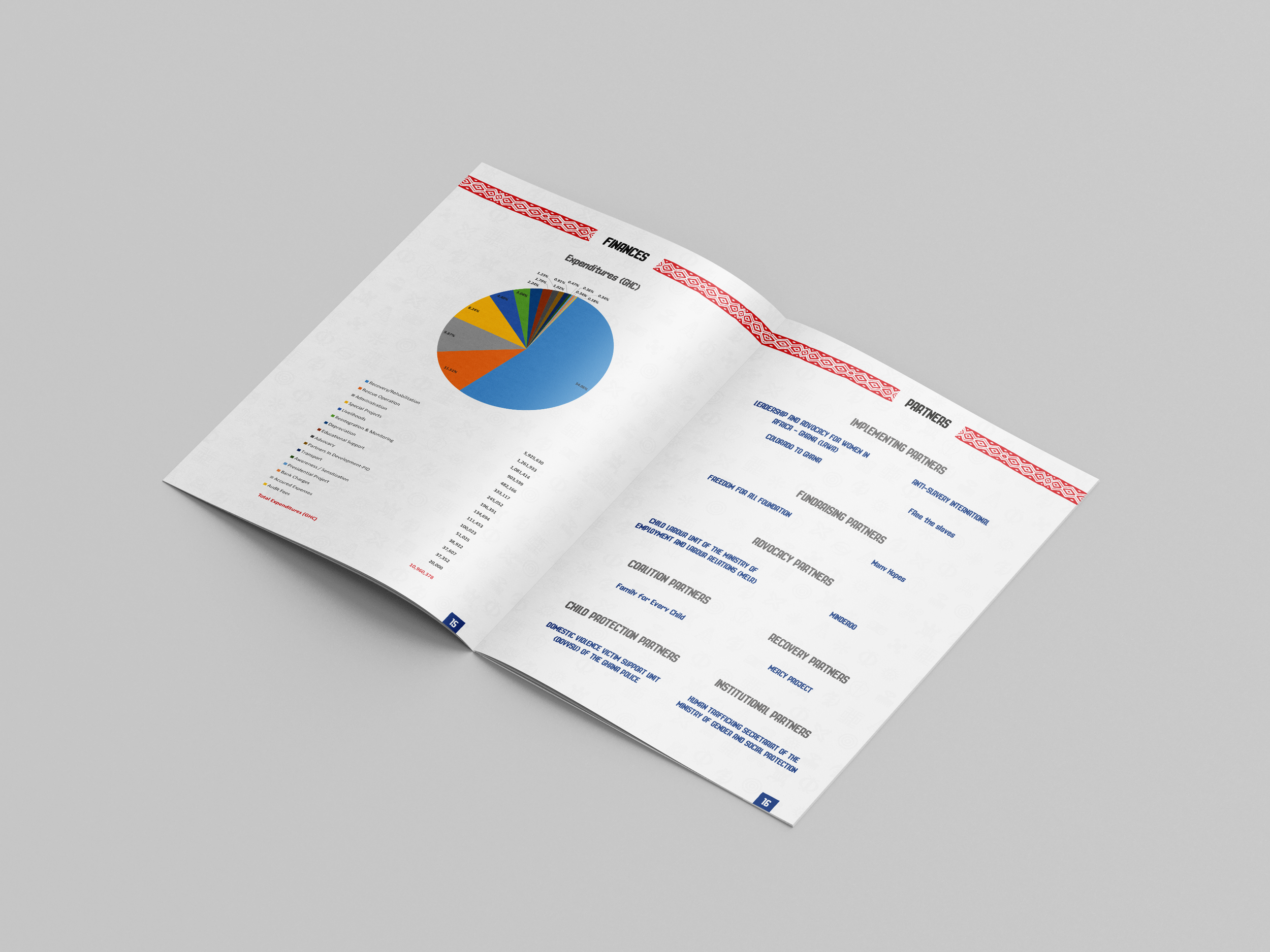
Some sections are naturally heavier — like education data, advocacy updates, and financial breakdowns.
Instead of simplifying the content, the design helps navigate it:
Clear hierarchy
Visual separation between sections
Charts and layouts that guide the eye
So even detailed information still feels approachable.
A report that works for the people using it
The final report gives the team something they can actually use.
Not just a document — but a tool:
Clear enough for stakeholders
Engaging enough to hold attention
Structured enough to communicate impact quickly
And importantly — it reflects the scale and importance of the work behind it.
A foundation to build from
The final report did more than capture a year of work.
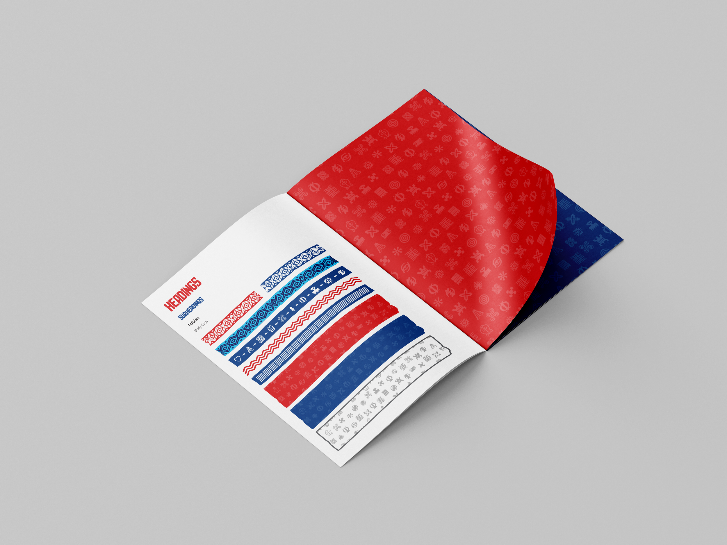
It also helped establish a clearer visual direction for Challenging Heights — one that could carry across future reports, communications, and materials.
Something consistent. Recognisable. Built to last. And inspired by the organisation’s local setting.